

- CSS
-
CSS
Alles anzeigen/* --------------------------------------------------------------------------------- * Section : Table of Contents (TOC) Component Enhancements * Package : WoltLab Suite Core 6.2 Text Layouts * Component : Dynamic Content Navigation (3-Level Container-Query Driven Grid) * Refactoring : Replaces the legacy, rigid framework TOC layout. * Summary : Implements a highly modernized, scalable multi-column grid * supporting up to 3 hierarchical levels (Level 1, 2 & 3). * Developer : Ronald Mordiconi * Last Update : 11.06.2026 * Stability : Production Stable / Multi-Level Safe * Note : This implementation completely deprecates the standard WoltLab * TOC layout to achieve an advanced, professional UI/UX standard * aligned with the global design language of the platform. * --------------------------------------------------------------------------------- */ /*** Design Tokens Central control – adjust values here only. ***/ :root { --toc-spacing: 1.5rem; --toc-half-spacing: 0.75rem; --toc-font-size: 1.05rem; --toc-col-gap-md: 2.5rem; --toc-col-gap-xl: 3rem; --toc-accent: #1e64b4; /* Main accent color */ --toc-accent-soft: rgba(30, 100, 180, 0.25); /* Accent at 25% opacity */ --toc-accent-faint: rgba(30, 100, 180, 0.15); /* Accent at 15% opacity */ --toc-bg: rgba(30, 100, 180, 0.04); /* Accent at 4% opacity */ --toc-title-color: #1e64b4; /* Title text color */ --toc-marker-color: #1e64b4; /* Number marker color */ --toc-link-hover: #1e64b4; /* Link hover color */ --toc-link-color: var(--wcfContentLink, #ccc); /* Inherits from WCF theme */ --toc-sub-color: var(--wcfContentDimmedLink, #aaa); /* Inherits from WCF theme */ --toc-border-radius: 6px; --toc-transition: 0.2s ease; } /*** Reset Removes framework-side leftovers that would interfere visually. ***/ .tableOfContentsWrapper, .tableOfContentsContainer, .tableOfContentsContainer .tableOfContents, .tableOfContentsContainer .tableOfContents li { outline: none; box-shadow: none; border: none; } /*** Wrapper ***/ .tableOfContentsWrapper { width: 100%; max-width: 100%; margin: var(--toc-spacing) 0; container-type: inline-size; /* Anchor for Container Queries */ } /*** Header & Title ***/ .tableOfContentsHeader { display: block; width: 100%; margin-bottom: var(--toc-half-spacing); position: relative; text-align: left; /* Thin horizontal line across container */ background-image: linear-gradient(to right, var(--toc-accent-faint), var(--toc-accent-faint)); background-size: 100% 1px; background-position: bottom left; background-repeat: no-repeat; } .tableOfContentsTitle { display: inline-block; font-size: var(--toc-font-size); font-weight: 700; margin: 0; padding-bottom: 0.4rem; text-align: left; color: var(--toc-title-color); text-transform: uppercase; letter-spacing: 0.08em; position: relative; } /* Thick 5rem accent line */ .tableOfContentsTitle::after { content: ""; position: absolute; bottom: 0; left: 0; width: 5rem; height: 2px; background-color: var(--toc-accent); z-index: 1; } /*** Main Container ***/ .tableOfContentsContainer { position: relative; width: 100%; margin: var(--toc-spacing) 0; padding: var(--toc-half-spacing) 1rem; background: var(--toc-bg); border-radius: var(--toc-border-radius); border-left: 3px solid var(--toc-accent); } /* Dotted separator lines (Top & Bottom) */ .tableOfContentsContainer::before, .tableOfContentsContainer::after { content: ""; position: absolute; left: 0; right: 0; height: 1px; background-image: repeating-linear-gradient( to right, var(--toc-accent-soft) 0px, var(--toc-accent-soft) 1px, transparent 1px, transparent 5px ); } .tableOfContentsContainer::before { top: 0; } .tableOfContentsContainer::after { bottom: 0; } /*** Numbering & Multi-Level Lists (CSS Counters) ***/ /* --- LEVEL 1 (Highest Heading found, e.g., H2 or H3) --- */ .tableOfContentsContainer .tableOfContents.tocLevel1 { list-style: none !important; margin: 0; padding: 0; counter-reset: toc-l1; column-count: 1; /* Default mobile view */ } .tableOfContentsContainer .tableOfContents.tocLevel1 > li { list-style: none !important; counter-increment: toc-l1; counter-reset: toc-l2; /* Resets Level 2 counter */ padding: 0.3rem 0; line-height: 1.5; } .tableOfContentsContainer .tableOfContents.tocLevel1 > li::before { content: counter(toc-l1) ". "; font-weight: 700; font-size: 0.8em; color: var(--toc-marker-color); margin-right: 0.3rem; letter-spacing: 0.03em; } .tableOfContentsContainer .tableOfContents.tocLevel1 > li > a { color: var(--toc-link-color); text-decoration: none; font-weight: 500; transition: color var(--toc-transition); } .tableOfContentsContainer .tableOfContents.tocLevel1 > li > a:hover { color: var(--toc-link-hover); } /* --- LEVEL 2 (Sub-Heading, e.g., H3 or H4) --- */ .tableOfContentsContainer .tableOfContents.tocLevel2 { list-style: none !important; padding-left: 1.25rem; margin: 0.2rem 0 0.2rem 0.2rem; counter-reset: toc-l3; /* Resets Level 3 counter */ border-left: 1px solid var(--toc-accent-faint); /* Subtle vertical guide line */ } .tableOfContentsContainer .tableOfContents.tocLevel2 > li { list-style: none !important; counter-increment: toc-l2; padding: 0.15rem 0; line-height: 1.4; } .tableOfContentsContainer .tableOfContents.tocLevel2 > li::before { content: counter(toc-l1) "." counter(toc-l2) " "; font-weight: 400; font-size: 0.78em; color: var(--toc-marker-color); margin-right: 0.3rem; opacity: 0.75; } .tableOfContentsContainer .tableOfContents.tocLevel2 > li > a { color: var(--toc-sub-color); font-size: 0.88em; text-decoration: none; transition: color var(--toc-transition); } .tableOfContentsContainer .tableOfContents.tocLevel2 > li > a:hover { color: var(--toc-link-hover); } /* --- LEVEL 3 (Deep Sub-Heading, e.g., H4 if H2 and H3 are present) --- */ .tableOfContentsContainer .tableOfContents.tocLevel3 { list-style: none !important; padding-left: 1rem; margin: 0.1rem 0 0.1rem 0.2rem; border-left: 1px dotted var(--toc-accent-faint); /* Dotted deep guide line */ } .tableOfContentsContainer .tableOfContents.tocLevel3 > li { list-style: none !important; counter-increment: toc-l3; padding: 0.1rem 0; line-height: 1.3; } .tableOfContentsContainer .tableOfContents.tocLevel3 > li::before { content: counter(toc-l1) "." counter(toc-l2) "." counter(toc-l3) " "; font-weight: 400; font-size: 0.75em; color: var(--toc-marker-color); margin-right: 0.3rem; opacity: 0.6; } .tableOfContentsContainer .tableOfContents.tocLevel3 > li > a { color: var(--toc-sub-color); font-size: 0.85em; text-decoration: none; opacity: 0.9; transition: color var(--toc-transition); } .tableOfContentsContainer .tableOfContents.tocLevel3 > li > a:hover { color: var(--toc-link-hover); opacity: 1; } /*** Responsive Layout Architecture (Container-Query Driven) ***/ @container (min-width: 550px) { .tableOfContentsContainer { padding: var(--toc-spacing) 1.25rem; } } /* Breakpoint 1: 2 Columns (Triggers at 4+ Level 1 entries) */ @container (min-width: 700px) { .tableOfContentsContainer.open .tableOfContents.tocLevel1:has(> li:nth-child(4)) { column-count: 2; column-gap: var(--toc-col-gap-md); column-rule: 1px solid var(--toc-accent-faint); column-fill: balance; } /* Structural lock: Entire blocks (H2+H3+H4) never split across columns */ .tableOfContentsContainer.open .tableOfContents.tocLevel1 > li { break-inside: avoid-column; -webkit-column-break-inside: avoid; page-break-inside: avoid; } .tableOfContentsContainer.open .tableOfContents { margin-bottom: 0; } } /* Breakpoint 2: 3 Columns (Triggers at 4+ Level 1 entries) */ @container (min-width: 1100px) { .tableOfContentsContainer.open .tableOfContents.tocLevel1:has(> li:nth-child(4)) { column-count: 3; column-gap: var(--toc-col-gap-xl); } } /*** Accessibility ***/ @media (prefers-reduced-motion: reduce) { .tableOfContentsContainer, .tableOfContentsContainer .tableOfContents, .tableOfContentsContainer .tableOfContents a { transition: none; animation: none; } }
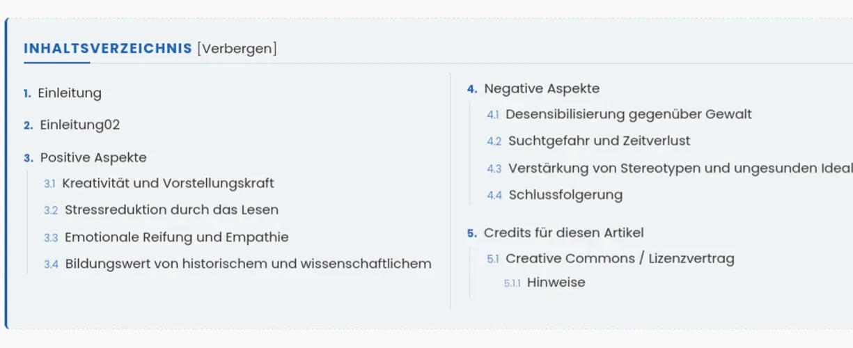
Dieses CSS-Snippet ersetzt das standardmäßig sehr starre und rein vertikale Inhaltsverzeichnis (TOC) der WoltLab Suite durch eine moderne, hochprofessionelle UI/UX-Komponente.
Kernfeatures:
- Container Query-Steuerung: Das mehrspaltige Layout berechnet sich nicht nach der totalen Bildschirmbreite (Media Queries), sondern individuell nach der tatsächlichen Breite des Text-Containers. Dadurch funktioniert das Grid in Artikeln, Foren-Themen oder Core-Seiten immer fehlerfrei – völlig unabhängig davon, ob Sidebars aktiv sind oder nicht.
- Redaktionelle Ästhetik-Regel :has Die Umschaltung in den 2- oder 3-Spalten-Modus erfolgt über den modernen :has()-Selektor erst dann, wenn das Verzeichnis mindestens 4 Hauptüberschriften aufweist. Bei kürzeren Texten bleibt das Verzeichnis elegant einspaltig, um unschöne, leere Teillayouts (Spaltenstümpfe) im Sinne eines sauberen Schriftsatzes zu verhindern.
- Sichere Informationsblöcke: Durch break-inside: avoid-column wird garantiert, dass verschachtelte Unterüberschriften niemals von ihrer übergeordneten Hauptüberschrift getrennt und über Spaltenkanten zerrissen werden.
- 3-stufiges CSS-Counter-System: Das Snippet überschreibt das native Listendesign vollständig und rendert mittels CSS-Countern saubere, typografisch ansprechende Nummerierungen für bis zu drei Inhaltsebenen 1., 1.1, 1.1.1.
Beeinflusste Elemente: Das Snippet greift gezielt auf die nativen Framework-Klassen .tableOfContentsWrapper, .tableOfContentsHeader, .tableOfContentsTitle, .tableOfContentsContainer sowie die verschachtelten Listenstufen .tocLevel1, .tocLevel2 und .tocLevel3 zu. Es greift nicht in das globale Artikellayout ein.
Individuelle Anpassungsmöglichkeiten (Zentrale Steuerung via :root Alle Designmerkmale lassen sich im oberen :root-Block zentral anpassen:
- --toc-accent: Haupt-Akzentfarbe für Titel-Highlights und Rahmen (z. B. Foren-Hexcode).
- --toc-accent-soft / -faint / -bg: Steuerung der Opazität für feine Trennlinien und den Container-Hintergrund.
- --toc-spacing / --toc-half-spacing: Flexibles Padding und Margin-Abstände.
- --toc-font-size: Basis-Schriftgröße des Titels.
- --toc-col-gap-md / -xl: Spaltenabstände im Desktop- und Großbildschirm-Modus.